
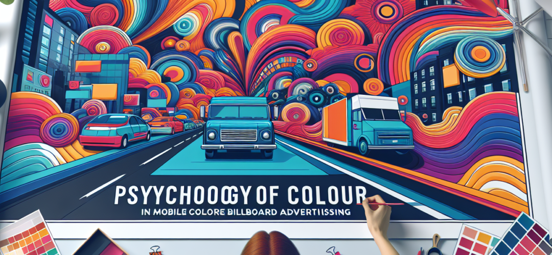
Colour is a universal language that speaks to our emotions, behaviours, and decision-making processes. In the world of advertising, its power is monumental. As brands strive to make a memorable impact, the psychology of colour plays a pivotal role in capturing the attention of audiences. This is especially true for mobile billboard advertising, where captivating designs are paramount. In the vibrant and bustling backdrop of the UK, where competition for attention is fierce, understanding the psychology of colour can be the key to success. Kika Media, a leader in dynamic outdoor advertising solutions, recognises this potential, offering a wide range of visually stunning and mobile advertising formats.
The Power of Colour in Advertising
Colours can evoke emotions, influence perceptions, and drive behavioural responses. In the context of mobile billboard advertising, where the objective is to grab and retain attention, the right colour palette can make all the difference. According to a study by the Institute for Colour Research, people make a subconscious judgement about a product within 90 seconds, and about 62-90% of that assessment is based on colour alone.
Consider the strategic use of colours in Kika Media’s mobile digital billboard trucks. These mobile marvels traverse urban landscapes, delivering vibrant visuals that stand out amidst the grey of cityscapes. By employing a thoughtful blend of colours, Kika Media ensures that their advertising stands out, effectively communicating brand messages to the target audience.
Cultural and Contextual Considerations in Colour Psychology
Understanding the cultural significance of colours is crucial when designing billboard advertisements for diverse audiences across the UK. Colours can mean different things in different cultures, so it’s important to tailor campaigns to specific regions and demographics. For instance, while blue is commonly associated with trust and professionalism in Western cultures, it can be seen as a colour of mourning in some Eastern cultures.
For UK audiences, specific colours can evoke strong reactions. Red, for example, is often linked with excitement and urgency, making it an excellent choice for promotions or time-sensitive campaigns. Green, on the other hand, is associated with nature and is often used to promote environmentally-friendly messages. Kika Media’s strategic use of static mobile billboard trailers showcases the importance of cultural and contextual awareness in colour selection, ensuring campaigns are both impactful and appropriate.
Colour Combinations That Captivate
The effectiveness of colour in advertising is not just about individual hues but the combinations that create visual harmony or contrast. High-contrast colour schemes can make a message pop, while analogous colours offer a more cohesive and elegant look. The choice between these depends on the brand identity and the message being conveyed.
Kika Media’s LED advertising vans leverage the power of colour combinations to deliver eye-catching designs that are as memorable as they are engaging. By paying attention to how colours interact, brands can create ads that are not only aesthetically pleasing but also more likely to be remembered by viewers. The use of complementary colours, such as orange and blue, can create a dynamic visual experience that captures attention and enhances brand recall.
Leveraging Colour in Different Advertising Formats
Different mobile billboard formats offer unique opportunities to experiment with colour. Backlit billboard trucks, for instance, can make use of vivid colours that appear to glow in the dark, creating a striking visual impact during night-time campaigns. Similarly, illuminated ads can transform a simple colour scheme into a captivating light show that draws the eye in the dimly lit streets of London and beyond.
Kika Media is adept at using these formats to their full potential, offering clients flexible routes and dynamic content displays that can be tailored to specific audiences. This versatility makes it easy to adapt the use of colour to different times of day, locations, and audience demographics, ensuring maximum engagement and recall impact.
Colour as a Tool for Branding and Identity
In the cluttered marketplace of the UK, having a distinct brand identity is crucial for standing out. Colour is one of the most potent tools in establishing and reinforcing a brand’s identity. It serves as the visual shorthand for what a brand stands for and can be instrumental in boosting brand loyalty and recognition. For instance, brands like Coca-Cola and McDonald’s have harnessed the power of red and yellow, respectively, to become instantly recognisable.
Kika Media’s comprehensive suite of services, from fleet branding campaigns to custom-branded vehicle wraps, empowers businesses to capitalise on colour to reflect their brand’s values and mission. By ensuring that a brand’s colours are consistently applied across various advertising formats, businesses can significantly enhance their visual identity and stand out in the competitive advertising landscape.
Ultimately, the psychology of colour in mobile billboard advertising is an intricate dance between art and science. It’s not just about choosing the right colours; it’s about understanding how those colours interact with audiences on an emotional and psychological level. With its expertise and innovative approach, Kika Media helps brands navigate the colourful world of mobile advertising, ensuring each campaign is as visually compelling as it is strategically sound.
Whether you’re a local business looking to boost brand awareness or a corporate entity aiming for widespread reach, the strategic use of colour in mobile billboard advertising can be your secret weapon. Through Kika Media’s geo-targeted advertising routes and real-time digital ad updates, your message will resonate not just visually, but emotionally, leaving a lasting impression on your audience.
Get in Touch
Looking for a Mobile Billboard Advertising contact Kika Media, today!
Call us: 0333 335 7755
Visit: Mobile Billboard Advertising
